How we’ve made data visual at University Hospital Southampton
- 4 October 2018

There is no shortage of data in modern healthcare, but the means to pull it together quickly and easily and then to understand it are often lacking. Not so at University Hospital Southampton, where a small team has adapted a 1990s data visualisation concept from US academics into working system they describe as transformative. Project lead and consultant surgeon David Rew explains more.
By the late noughties, we realised that the looming NHS digital transformation programme would create major challenges of information integration, visualisation and understanding as paper records were retired at our trust. We sought a new format for clinical data visualisation which would make best use of our records, which had been formally structured and standardised since 1995.
We discovered the concept work of Professor Ben Shneiderman and colleagues at the Human Computer Interaction Lab, University of Maryland. The power of their framework model for an interactive healthcare record, codenamed Lifelines, which we have also adopted, had not been recognised or taken up at that time.
Agile and iterative
I proposed Lifelines as a concept worth exploring to the University Hospital Southampton (UHS) IT team, and to UHS IT systems consultant Alan Hales. Alan and I then worked in a highly agile and iterative way to adapt the original Lifelines concept from curiosity-based discovery into a practical system.
The evolving product, UHS Lifelines, is now live for more than 5,000 users within our electronic patient record (EPR), and for 2.5 million individual health records. It remains under continual development as new data sources are integrated into it.
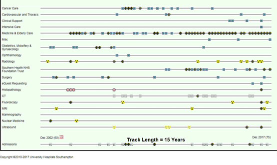
UHS Lifelines is based around a stack of synchronised timelines, on which documents, results and reports are plotted as interactive icons, according to their historic subject, date and time stamps (also known as metadata) on a dynamic two dimensional chart. The X axis displays time from left to right, and the vertical axis can display any number of data timelines for which a subject taxonomy exists.
This is a conceptually very simple but operationally radical approach to the real time visualisation and interrogation of a complex clinical record. It allows large quantities of clinical information to be displayed on a single computer screen. It allows users to harness the high speed powers of the visual brain to “read the story” in the mass of information held in the iconographic patterns, and to select and access key documents in seconds.

UHS Lifelines also adheres to Professor Shneiderman’s mantra for the visualisation of large datasets. It provides an overview of the entire documentary record; and it allows the user to zoom in on key documents and to filter out extraneous screen clutter, while directly accessing details on demand. It permits faster, better and safer clinical decisions with less user fatigue.
Intuitive and speedy
The methodology is highly intuitive in practical use with minimal training. It is very fast when compared with traditional e-document search strategies using tabs, multiple windows and lists. It reduces the time spent in outpatient clinics in searching digital record sets from minutes to seconds, while substantially reducing the risk of missing critical information and patterns in the record set.
UHS Lifelines also brings clinical immediacy to historic e-documents of any age. For example, it prompted the restoration and upload into the system of 500,000 UHS histopathology reports dating back to 1990.
We believe that the UHS Lifelines exemplar provides an elegant framework for a standard, safe and controllable EPR for all UK citizens. It can integrate and display all key data from primary, secondary, social, community and mental healthcare into a single interactive framework.
Control over information access
The interposition of icons between the viewer and the source information also allows control over access to sensitive information, while acknowledging its existence. Through it, first responders could have controlled and selective access to critical personal data in an emergency.
The UHS Lifelines model could enable individual citizens to access their own total health record in a controlled and structured way, whether from mobile or desktop apps. The iconography also provides a simple and understandable framework for the application of machine analysis to predict health patterns, trends and future NHS resource needs.
UHS Lifelines has been built at negligible cost to UHS or to the NHS. It illustrates the power of user-driven digital design and agile principles at grass roots level in the NHS to address the complex global challenges of health data management.
David Rew is a consultant general surgeon at University Hospital Southampton, and concept lead for the UHS Lifelines Project within the trust’s global digital exemplar programme. He is a member of the strategic advisory team for healthcare technologies for the Engineering and Physical Sciences Research Council (EPSRC) and visiting professor in information technology to Southampton Solent University, whose students have contributed significantly to the development of the UHS Lifelines system.
He and his colleagues welcome enquiries from anyone interested in finding out more about the work.


2 Comments
Dear Brendan
A very fair question on an essential element of the project. We collect all usage data and we have had a postgraduate student working through the summer to develop an informative data analytics dashboard. This will help us better to understand usage across the entire hospital, as staff in many different disciplines adapt to a new (and optional) way of looking at clinical records. It will also help us to design with data as we move through the “Public Beta” phase of the programme.
An interesting project as bridging the gap between clinicians and their access to and assimilation of available data at the point of need to improve patient outcomes is critical. How is the impact of this innovation being evaluated in real-world settings?
Comments are closed.